|
|
Post by StrathWriters on Feb 12, 2008 20:34:17 GMT
I outlined this on the front page of the website, but just to go over it again.
So that it's not one person making the decisions (although - for those doing power - it does feel sorta like I'm agenda setting here), we're going to vote on which theme we would like for the website. The more people that vote the better.
All you have to do is look at the skins used on each page of the website and then vote on here for which you think should go on the whole website, and which will in turn, govern the colours of this forum as well.
Vote wisely!
|
|
|
|
Post by auroralight88 on Feb 19, 2008 0:02:20 GMT
i also like the idea that every page is different, but if i had to choose, i would pick the yellow notepad (which i voted for).
but my second fave is the competitions page. it's so game-showy!
|
|
|
|
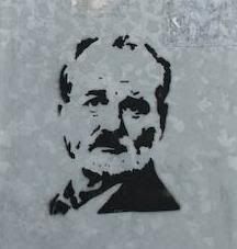
Post by auroralight88 on Feb 19, 2008 0:02:50 GMT
oops. forgot to mention that this was churchill!
|
|
|
|
Post by Miss O'Jenny on Feb 20, 2008 11:02:03 GMT
I was thinking about changing the rest of the pages and leaving the Competitions one as that, 'cause of the gameshow element, but we'll see what everyone else thinks.
|
|
thechew
Raw Recruit
 Even a broken clock is right twice a day. Unless it's an LCD display, then you're just foobarred.
Posts: 1
|
Post by thechew on Feb 20, 2008 21:40:26 GMT
Definately the dark page style, if only to save my eyes.
|
|
mike
Raw Recruit
Posts: 3
|
Post by mike on Feb 21, 2008 16:20:19 GMT
Is it possible a darker background could be put on the white notepad style? (Which I voted for)
|
|
mojojojoe
Tenacious Typer
The cold sweat in your breakfast
Posts: 232
|
Post by mojojojoe on Feb 22, 2008 1:06:12 GMT
Pictures one. It looks quite cool and my eyes are no longer screaming.
|
|
Starlong
The Master
I have a theory. Let's conspire about it...
Posts: 938
|
Post by Starlong on Feb 22, 2008 2:21:49 GMT
I agree with mike. A darker, or at least warmer background for the white notepad would be nicer on the eyes, and has the potential to be the best one. Arguement: - The home page has a good style but the colour of the notepad is the kind of light custard that I reckon ought to be banned from the internet... The grey background is very drab, there's no joy in that page whatsoever. - The white and black of the second page is nice and simple, and white is the colour on which most text is displayed. I particullary like the torn edge going down the left. I voted for this one, partly to try and keep the other two current leaders out, and partly because if the background was darker, warmer, anything but grey, or the aforementioned dreaded custard, it would be a winner. - The competition page style suits competitions in it's sparkling glory, but it definately wouldn't suit the rest of the site. - The dark picture page. It looks cool. It looks badass even, but it's too much, and would probably suit a blog or personal page more than a small website - Contact... It's nice, soothing on the eyes and almost tranqil. But it gets boring after a few seconds because it's so neutral. It feels drained of contrast and excitement (probably not the right adjective, but nevermind...). It doesn't have a writers feel like the first two pages have for sure, and it's in no way thrilling like the picture page. It's just nice. That's the most coloutful adjective it gets. - Links: I very nearly voted for this, because even though I'm never an orange/peach type person, I really like the warm colours with the white, it makes it very readable and it it would have gotten my vote except it seemed like a wasted vote looking at the tally board, and like the Contact page before it, there was a lack of the whole writer feel which the first two pages have *down* So, really, what I think would look good is the second page with the border of the last page  Also, I love the pipe and giant safty pin remarks! It shows how easily threats of violence can be funny p.s. this is Tom |
|
|
|
Post by Some Guy on Feb 22, 2008 12:43:44 GMT
I like the yellow notepad style of its present condition and have prepared a counter-argument against Starlong's line of discourse in an effort to further forward this custard-yellow claim to the entire website:
Reason Number One: It doesn't suck ass.
Reason Number Two: I said so.
That pretty much covers it.
|
|
kitty
Captain of the Forum
Posts: 136
|
Post by kitty on Feb 22, 2008 13:38:30 GMT
Agreeing with mike as well. Darker background would be preferred on the writerisms.
The pictures one is prettier but any more text on it and I'd be seeing lines every time I looked away. Most unpleasant.
|
|
|
|
Post by Miss O'Jenny on Feb 28, 2008 18:55:25 GMT
I would like to apologise for being so crap at this and assure everyone that I have read and listened to everything everyone has to say. I have also spent hours trying to figure out a way to make it darker, but google is retarded and doesn't like the idea of too much free will. So until they change their rules/ I find a way around them/ I finally learn how to build a decent website, I'm going to go with the Writerisms one. It did get the most votes.
I've discussed this with Emma and we both agree that while it's not perfect, people won't actually be spending that much time on website except possibly to get here, and therefore as long as it looks vaguely good for new comers, then we'll be fine.
I will change the skin for the forum so that is darker.
Sorry again, guys.
|
|